
Alphabet soup - Task 2
Before we
received our brief we were assigned a partner from the group, we where
then each given a sheet of questions to ask each other. This collected
information would form the base for our research. I typed up the notes taken
during that session, they can be seen below.
What is
your favourite colour?
Purple
What is
your earliest memory?
When she
was younger a friend pushed her over her scooter handlebars.
Which
living designer do you admire the most, and why?
Rob Ryan,
he’s a paper craft artist who creates really intricate pieces.
What is
your most treasured possession?
Jesus
Bracelet given to her by grandmother.
What
would your super power be?
To be
able to read minds.
Which
piece of graphic design do you wish you had created?
Who would
you invite to your dream dinner party?
The whole
Geordie shore crew and Heston Blumenthal.
What
makes you unhappy?
Bad
drivers.
What
would be your fancy dress costume of choice?
Salt and
pepper shakers.
Additional
information I found out was;
She does
Ballet and Modern dancing.
Really
likes collage and paper craft.
After we completed this task we were handed the brief.


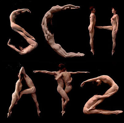
Above is my ideas generation, I have decided to
base my font around that fact that Melissa does dancing. First I have decided
to research into the possibility of basing my font on different dance poses.
The above image portrays how I could make my letter forms look like dancers. However, I would have to some how make them look more elegant as their body positions are too rigid.


 |
| http://www.netweed.com/allworlddance/bodytype.jpg |
The above image portrays how I could make my letter forms look like dancers. However, I would have to some how make them look more elegant as their body positions are too rigid.


| http://livinlargelovinlife.files.wordpress.com/2012/08/beijing-olympic-sports-logo.jpeg
I then found the branding for the Beijing Olympics, the logos that were created for each of the sports are simple, flowing stick characters. However, they are effective and portray the sport intended. I like how the lines of the body flow, it is an element that I want to use when creating my letters to make them look
more elegant. |

 |
| http://fc04.deviantart.net/fs9/i/2006/034/4/d/Body_font_by_CommunistOlga.jpg
This is a body themed font, although it is much
simple and lacks body features. All aspects of the human body such have the head have been removed and
the letters have been left as legs and shoes. This concept would not work for
me as it is not linked to dancing. However, it has made me think about how legible my letters will be when crating my font.
|

Moreover, this is another
body themed font. However, this time the body features are noticeable. I am
going to experiment with creating letters like this but more simple and flowing
alike the Beijing Olympic illustrations.

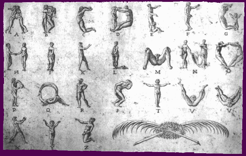
Character alphabet designed by illustrator Yoswadi Krutklom
|
After some
experimentation sketches I am having doubts about how my initial
concept would look. Therefore I have decided to further my research and look at
some other possibilities.


The
above typeface was done by Therese Vandling, a graphic designer based in London. The letters mix
illustration and collage to make up the letterform, Melissa mentioned that one
of her interests was paper art and collage. Therefore, I could look at creating
something similar, mixing illustration and collage to create my letters. I will
find out more information about Melissa’s interests and hobbies to help me form
the content.
 |
| http://www.behance.net/Gallery/Life-in-the-Alphabet_/322840
Eibatova Karina is a designer from Russian, she
designed the typeface around the idea of natural forms. I think the letterforms
are remarkable and the detail that is achieved is amazing. Each letter is done in pencil, scanned in and
left untouched. I really like the illustrations and how they have been adapted
to fit the letterform, I will need to consider how I will compose my letters. I
believe this alphabet works so well as each letterform uses one strong theme,
it will be hard for me to achieve this as I am mixing collage and illustration.
 An Illustrated Alphabet by Jakub Konvica, she has used the same concept as me but her alphabet has different content. My aim is to produce letterforms similar to this that utilize both illustration and collage.
This
typeface was created by German graphic designer Silja Goetz. She used a mix of
Victorian clip art, photography and illustration to create her typeface; I hope
to produce mine in a similar way.

These 'Alphabirds' were created by illustrator Andrea Kalfas. This alphabet adapts the shape of birds to create letterfroms. I have chosen to look at Kalfas' work as i like how she has kept her illustrations simple, so that adapting the shape was easy. I need to consider how i will adapt my illustration and collage to create letterforms.

Alphabet designed by Yuko Michishita

illustrated typeface by Tsepo Makate

A hand-drawn alphabet based on gestalt created by Jaci Kessler. This is very similar to what i want to produce using objects to portray letterform and Melissa's personality
Now I had a good idea of how I am going to produce my alphabet I
will start researching possible fonts I could use as a base. However, I don’t
think its as important researching they letter base because of how I will be producing
the letters. Therefore, I will spend less time researching typefaces so I can
focus more of my time on producing my alphabet.

This
typeface is called ‘coolvetica’ it’s a sans serif font that’s based on American
signage in the 1970’s. The font is based
on Helvetica as at the time everyone was modifying the font such as sign-makers
and designers to suit their own purpose. I chose the font as its basic and bold
making it perfect for a base font.

This font is called ‘Splendid plan nine’ and was designed by
Jayvee D.
Enaguas. I have decided to look at this typeface as its a basic, big, bulky
font.
I
have decided against researching into more fonts as I think that having a base
font wont be overly useful when I start creating the letterforms. Therefore, I will start collecting imagery to work with.
|
No comments:
Post a Comment