
For our second context of practice session we had to bring
examples of work we either loved or hated. We had to bring a total of six
images, two displaying just type, two displaying only image and two displaying
both type and image.
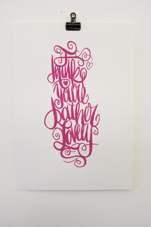
Here are the examples of work that I like.


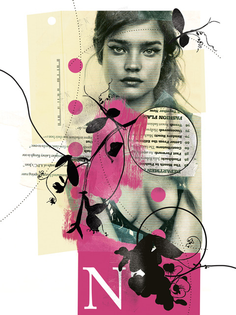
Here are the examples of work I dislike.


Next, we the produced a list of aesthetic reason as to why
we either likes or disliked the designs. Using this list as a reference, we
then used sticky notes to document the specific aesthetic reasons as to why we
liked or disliked our designs.


The next exercise requested us to swap our three images with
another person. We were given a short amount of time to look at the work, then
we had to write our personal opinion of the aesthetic quality. This exercise
showed us how good design should instantly communicate the message in a clear
yet visually appropriate way. Moreover, I also learned that initial response is
subjective, and is based on personal influences and taste.


Then as a class we created a refined list of aesthetic rules, it was hard to create rules that didn’t include anything about style or skill.
Aesthetic Rules
- All design must use no more than three typefaces.
- All design should be structured.
- Designs should use limited colours.
- The message must be clearly communicated.
- The composition of the design must be balanced.
- Type used on the design should be legible.
- Aesthetic should help contextualise image.
- The aesthetic must not overpower the function.
- The aesthetic should be refined.
- Simplicity is key.
No comments:
Post a Comment