
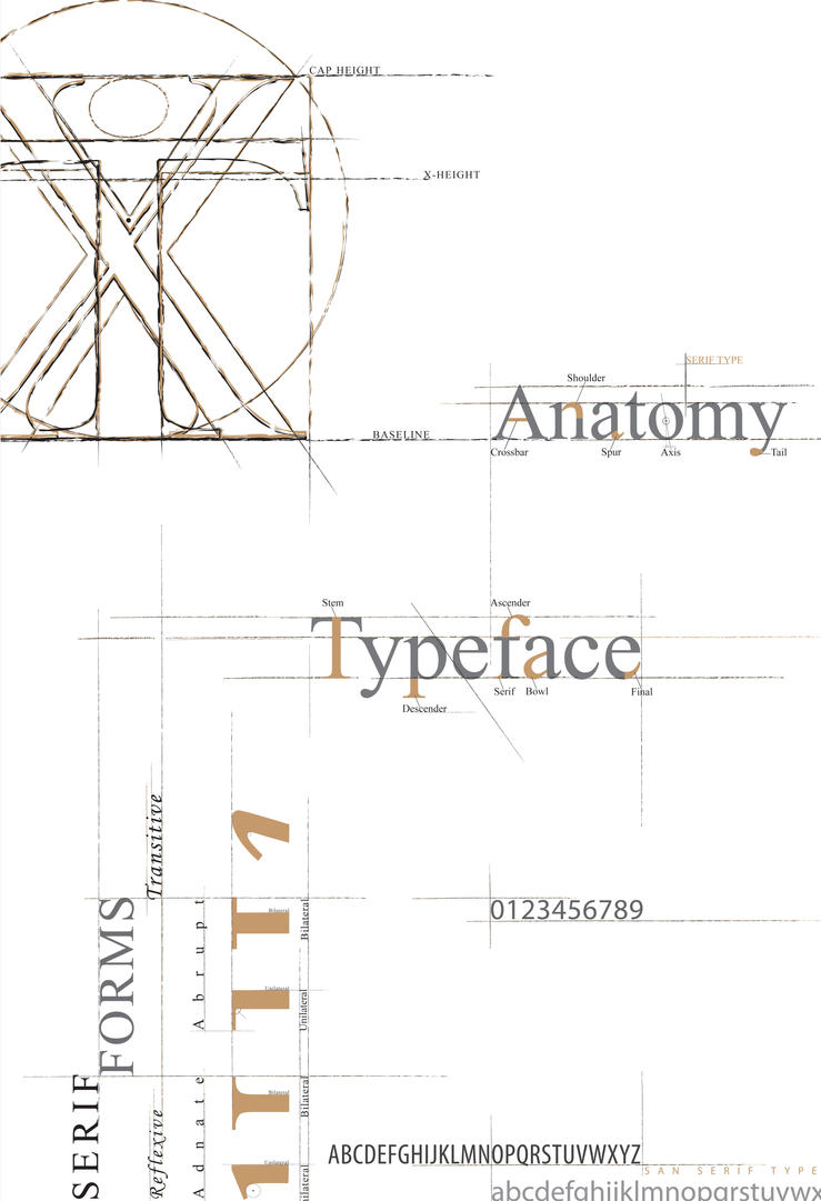
Anatomy of Type
I started my research by looking up each of the 10 things in two books I have, the first one I used is called 'The Fundamentals of Typography' By Gavin Ambrose & Paul Harris. A page on typeface hierarchy can be seen below.

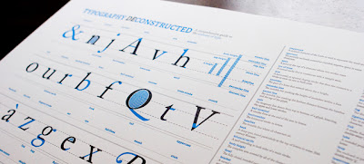
I found this really interesting poster created to help people with their typeface anatomy. The poster uses example letters and highlights different parts of the letter in blue, the terminology for these parts can be found in a key next to the diagram. I want to produce something similar to educate the audience about typeface anatomy.


Typeface Hierarchy


Legibility and Readability

The Fibonacci Sequence


The Golden Mean


Grids

I started my research by looking up each of the 10 things in two books I have, the first one I used is called 'The Fundamentals of Typography' By Gavin Ambrose & Paul Harris. A page on typeface hierarchy can be seen below.


Moreover, this design has also made me consider having a pull out poster similar to the one shown above. The poster could fit in the centre of the booklet, and be pulled out so students can stick it on their walls/noticeboards.

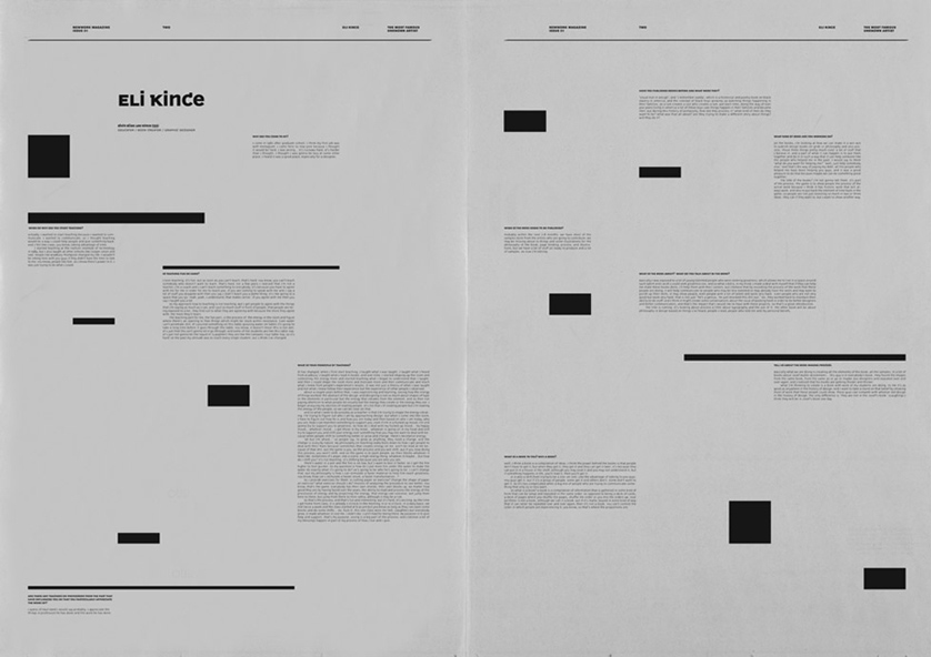
Moreover, this piece delivers the same information as the poster but presents it in a different way to what I have previously seen. The designer has used a grid to help them organise the layout of the design and has also left evidence of the grid so it is viewable to the audience.

Typeface Hierarchy


Pages scanned in from a book I own called 'The Fundamentals of Typography' By Gavin Ambrose & Paul Harris.
- One of the most important things to remember when working with typography is typeface hierarchy.
- Hierarchy is a logical and visual way to express the importance of different text elements.
- A text hierarchy is key to achieving a clear, easy to follow article.
- The title is usually the largest, boldest font to reflect its importance.
- Subtitles are slightly smaller to distinguish them as the subsidiary text to the title.
- Body copy can be set with a different type size but the same weight as the subtitle.
- Captions usually use a text that is less prominent than the body copy.
- The key to a successful text hierarchy is to understand the types of information being displayed.
- Not all outcomes need a complicated text hierarchy, it should be used to as a way of achieving functionality.
- Colour can also be used to affect the hierarchy, as it can be used as a way of guiding the viewers eye to certain elements of the page.
This page shows a good use of type hierarchy.
Things to consider when planing page hierarchy.
Size:
Size is one of the most obvious ways of dividing information. Put simply, larger text will usually be read before smaller text. This is not always the case of course, as sometimes smaller text can be viewed as a block and therefore not read at all, where as larger text can encourage skim reading. Usually though large text will be read first. Something to remember with size however is to not have too many contrasting sizes, which will make your layout appear messy and reader won’t know where to begin, which brings us to our next point…

Consistency:
Consistency is a less obvious thing to think about with hierarchy. But the main goal when planning hierarchy is to organise your elements of information. Consistency helps us do this. By maintaining consistency across all sub headings for example, the reader knows that these are all of similar importance. A good example of consistency is in web design. It is good practice to have all links consistent so that the viewer will always recognise them. This consistency helps them find the information they are looking for quicker.
Colour:
Strong colours can always attract the attention first. Certain colours are more legible then others and considered stronger. On a white background red is often very powerful where yellow often struggles with legibility. On a black background however, yellow supposedly offers the heaviest contrast.

Contrast:
Contrast helps you define importance. Usually a reader will look to the darker objects first and place more importance on these. This can be utilised in typography to emphasise certain words or sentences. Often a heavier grey than normal for body text can be a elegant way of emphasising something.

Negative space:
Negative space is a sure way to place emphasis on other objects. A perfect example is the think small mini adverts. Though the picture of the mini is not particuarly large, the white space draws the eye straight to it, enforcing its importance.

Alignment:
Alignment again helps to keep a page organised and make it easier for the reader to navigate. Again this can help define importance by grouping elements together. Likewise, other information can be emphasised by breaking alignment. This is often the case in newspaper design with pull out quotes.

Legibility and Readability

Typefaces for Body Copy
For body copy there are two choices – old-style serif and sans-serif. Most other categories of typeface are too distracting. On paper, serif faces are generally the most readable which is why most newspapers and books are set using serif fonts for the body copy. The serifs help lead the eye from one character to the next. However on screen, sans-serif fonts (such as Arial, Verdana) are considered to be more readable. Sans-serif fonts have larger x-heights and little variation in stroke width. That does not mean that you should never use serif fonts on the web, you certainly can but it’s always a good idea to test out how easy it is to read text.
There are other factors which affect the readability of a block of text.
Lowercase and All Caps
Text set in lowercase is easier to read. When we’re reading we’re read in phrases, not letter by letter and the shape of a word is a factor in our recognition and speed of reading. When text is set in all caps every word looks like a rectangle. If you’ve ever received an email set in all caps, I’m sure you’ve found that as well as being difficult to read, it gives the impression that the sender is shouting. All caps are fine for short bursts of text such as headlines or for emphasizing single words, but avoid it for readability of body text.
Letter Spacing and Word Spacing
Letter spacing is the amount of space between letters (read more about tracking and kerning here) and word spacing, as the name implies the amount of space between words. Both are major factors in how readable body copy is.
Line Length and Justification
Whether it’s on the web or on a printed page, if a line is too long, it can be difficult to find the beginning of the next line. If a line is too short, it breaks up the phrases we recognize. A very simple rule of thumb is to use shorter lines with extra space between the words when using sans serif typefaces.
Reverse Type and Light or Heavy Weights
Black type on white or light background appears to be larger than white type on a dark background (reverse). To compensate, use a larger or bolder size and avoid typefaces with a dramatic variation in stroke thickness. Thin strokes tend to disappear when reversed out.
Basic colour theory
I will introduce the colour wheel, primary and secondary and tertiary colours.

I like the use of simple coloured diagrams on this spread, when creating my spread on colour I will support written information with diagrams similar to these.
 http://pinterest.com/pin/28358672625923566/
- The first thing every designer needs to learn about colour is the basic colour wheel.
- Yellow, Red and Blue are the primary colours, and the secondaries are orange, violet and green.
- The colours in between the secondaries and primaries are called tertiary colours.
- A well balanced colour composition requires all three primary colours to be balanced in equal quantities.
- Hue - The terms referrers to the unique characteristic of a colour that helps us visually distinguish them from one another. Hues are formed by different wavelengths of light.
- Saturation - This terms referrers to the purity of a colour. A highly saturated colour will have a strong hue, whereas a colour with a low saturation will have a pale, weak hue.
- Brightness - This term referrers to how light or dark a colour is. Changes in brightness can be achieved by mixing the colour with black or white.

This diagram referrers to how the eyes perceive colour, and the different wave lengths of light. I could also include information on how the eyes percieve light to help the audience get a greater understanding of colour theory.
RGB - CYMK Colour Modes
 Pages scanned in from a book I own called 'The Fundamentals of Typography' by Gavin Ambrose and Paul Harris
- Colour can be used to bring a design to life, but it must be used correctly. Using colour in the wrong way could cause problems with the outcome when printing.
- Colour control is one of the primary tasks a graphic designer is responsible for in the production process of an outcome.
- This process is controlled through colour management and a knowledge of colour theory.
- Colour management is essential in graphic design as different colour systems are used for screen and printed outcomes, preparing the design in the wrong colour mode can seriously affect the colours when the design is displayed.
- Colour spaces include RGB (red, green & blue) for screen based media and CYMK (cyan, yellow magenta & key) for printed media.
- However, there are also other colour systems, such as the six colour hexachrome printing process or the 16-bit system that can produce over 65,000 different colour variations.
- A colour is made up from different quantities of red green and blue light.
- The RGB colour mode is used for screen based media, it is an additive colour system, which means as two colours are mixed the produced colour is lighter.
- Moreover, when two additive primaries overlap they create a subtractive primary colour such as Cyan, Yellow or Magenta.
- When subtractive colours are mixed the lose chromatic value and get darker. Moreover, when two subtractive colours overlap they create the primarys colours of the RGB colour mode.
Itten's Seven Colour Contrasts
- Saturation contrasts highlight the purity of a colour to the audience, and help us define the difference between a colour with a strong chromatic value and a colour that looks washed out. A colour can be diluted using different methods, such as mixing it with white, black, grey or its complementary colour.
- Contrast of proportion (extension) is balancing the strength of a specific colour such as yellow, by surrounding it with another colour such as magenta. Contrast of proportion can be used to balance complementary colours that would usually cause a complementary contrast.
- Simultaneous contrast is formed when the boundaries between colours perceptually vibrate. For example, when a colour such as red is placed next to grey, the eye will generate its complementary colour despite it not being physically present.
- Contrast of warm and cool (temperature) is formed when a warm colour such as red or orange opposes a cold colour such as blue or green.
- The contrast of light and dark is formed by a juxtaposition of light and dark values, it is most apparent between black and white. When working with colour such as red and blue it is harder to see the contrast of light and dark. However, changing the colour values so they are monochromatic can help define the contrast.
- A complementary contrast is formed when complementary colours are juxtaposed Complementary colours are colours that are directly opposite each other on the colour wheel.
- Contrast of hue is formed by the juxtaposition of different hues. The greater the distance between hues on a colour wheel, the greater the contrast will be. The strongest hue contrast can be found between the three primary colours red, blue and yellow, as we move to secondary colours the contrast becomes less intense.
Basic colour theory
I will introduce the colour wheel, primary and secondary and tertiary colours.
I like the use of simple coloured diagrams on this spread, when creating my spread on colour I will support written information with diagrams similar to these.
http://pinterest.com/pin/28358672625923566/
- The first thing every designer needs to learn about colour is the basic colour wheel.
- Yellow, Red and Blue are the primary colours, and the secondaries are orange, violet and green.
- The colours in between the secondaries and primaries are called tertiary colours.
- A well balanced colour composition requires all three primary colours to be balanced in equal quantities.
- Hue - The terms referrers to the unique characteristic of a colour that helps us visually distinguish them from one another. Hues are formed by different wavelengths of light.
- Saturation - This terms referrers to the purity of a colour. A highly saturated colour will have a strong hue, whereas a colour with a low saturation will have a pale, weak hue.
- Brightness - This term referrers to how light or dark a colour is. Changes in brightness can be achieved by mixing the colour with black or white.
This diagram referrers to how the eyes perceive colour, and the different wave lengths of light. I could also include information on how the eyes percieve light to help the audience get a greater understanding of colour theory.
RGB - CYMK Colour Modes

Pages scanned in from a book I own called 'The Fundamentals of Typography' by Gavin Ambrose and Paul Harris
- Colour can be used to bring a design to life, but it must be used correctly. Using colour in the wrong way could cause problems with the outcome when printing.
- Colour control is one of the primary tasks a graphic designer is responsible for in the production process of an outcome.
- This process is controlled through colour management and a knowledge of colour theory.
- Colour management is essential in graphic design as different colour systems are used for screen and printed outcomes, preparing the design in the wrong colour mode can seriously affect the colours when the design is displayed.
- Colour spaces include RGB (red, green & blue) for screen based media and CYMK (cyan, yellow magenta & key) for printed media.
- However, there are also other colour systems, such as the six colour hexachrome printing process or the 16-bit system that can produce over 65,000 different colour variations.
- A colour is made up from different quantities of red green and blue light.
- The RGB colour mode is used for screen based media, it is an additive colour system, which means as two colours are mixed the produced colour is lighter.
- Moreover, when two additive primaries overlap they create a subtractive primary colour such as Cyan, Yellow or Magenta.
- When subtractive colours are mixed the lose chromatic value and get darker. Moreover, when two subtractive colours overlap they create the primarys colours of the RGB colour mode.
Itten's Seven Colour Contrasts


- Saturation contrasts highlight the purity of a colour to the audience, and help us define the difference between a colour with a strong chromatic value and a colour that looks washed out. A colour can be diluted using different methods, such as mixing it with white, black, grey or its complementary colour.
- Contrast of proportion (extension) is balancing the strength of a specific colour such as yellow, by surrounding it with another colour such as magenta. Contrast of proportion can be used to balance complementary colours that would usually cause a complementary contrast.
- Simultaneous contrast is formed when the boundaries between colours perceptually vibrate. For example, when a colour such as red is placed next to grey, the eye will generate its complementary colour despite it not being physically present.
- Contrast of warm and cool (temperature) is formed when a warm colour such as red or orange opposes a cold colour such as blue or green.
- The contrast of light and dark is formed by a juxtaposition of light and dark values, it is most apparent between black and white. When working with colour such as red and blue it is harder to see the contrast of light and dark. However, changing the colour values so they are monochromatic can help define the contrast.
- A complementary contrast is formed when complementary colours are juxtaposed Complementary colours are colours that are directly opposite each other on the colour wheel.
- Contrast of hue is formed by the juxtaposition of different hues. The greater the distance between hues on a colour wheel, the greater the contrast will be. The strongest hue contrast can be found between the three primary colours red, blue and yellow, as we move to secondary colours the contrast becomes less intense.
Semiotics
In modern society we extract meaning from simple pictures and symbols, semiotics explains why we interact with them and extract the meanings we do. It is important for a designer to have a knowledge of semiotics as it helps communication skills.
In modern society we extract meaning from simple pictures and symbols, semiotics explains why we interact with them and extract the meanings we do. It is important for a designer to have a knowledge of semiotics as it helps communication skills.


The Fibonacci Sequence

Pages scanned in from a book I own called 'The Fundamentals of Typography' by Gavin Ambrose and Paul Harris
- The Fibonacci sequence is a series of numbers in which each number is the sum of the two preceding numbers. Each number in the sequence is generated by the sum of the two numbers before it.
- The sequence is important because of its links to the Golden section.
- Additionally, the Fibonacci sequence can also be used to generate page sizes such as A4.
- The sequence is found throughout nature, and most of the creative subjects.
- The Fibonacci spiral is created by drawing quarter circles through the sets of Fibonacci squares.
- Additionally, the sequence can also be used in typography when working out text sizes.

Pages scanned in from a book I own called 'The Fundamentals of Typography' by Gavin Ambrose and Paul Harris
- The golden section can also be known as the golden ratio, golden mean or divine proportion.
- It is fundamentally used to generate paper sizes.
- Moreover, it can also be used to help achieve a balanced functional design.
- The Golden Section or Ratio is is a ratio or proportion defined by the number Phi (= 1.618033988749895… )
- The number has been used throughout history on ancient architecture such as the pyramids in Egypt, and in renaissance art.
- The golden section can be used to create page sizes, but also can be used to define where elements should sit on a page.
- It is the proportion rather than measurement that is important.
- The golden section is also directly relevant to my next topic, grids.

Grids
Grids are used in graphic design to help designer with the structure and balance of an outcome, they were traditionally used to help with the layout of typographic elements but are now used to help structure most graphic outcomes. They are important as they form a frame in which the designer can then place the elements of his design. Grids have been criticised by some because they are 'limiting', but what the critics fail to see is that grids are used as a guide, the designer then has the option to experiment with moving certain elements.


- Creating a grid is usually the first thing a designer will do when producing an outcome.
- Starting with a blank page the designer will create a grid using margins and columns, they form lines which help when placing the elements of the design on the page.
- There are many different types of grid a designer can choose from, the choice of grid should reflect the function of the page.
- Every gird is made up from the following parts - Margins, Flowlines, Columns, Rows and gutters.

BINDING TECHNIQUES
Furthermore, I also used a book called 'Making Handmade Books' by Alisa Golden to help me select a binding technique.
As my outcome is being produced for first year design students. I want my outcome to be produced to a high quality, therefore I will hand bound the book using techniques found from this book.
Furthermore, I will experiment with the chosen method when creating models for the book.

- This is a very simple single signature binding technique, this would be perfect for my outcome as it will also only be one signature in size.
- This technique is simple, so if I was going to reproduce the book it would be quick and easy to do.
- Because the technique is simple mistakes will be harder to make.

- This technique is much more complicated, but the binding would make the outcome lot more durable.
- The exposed spine would be aesthetically engaging for designers, but unfortunately the cover would hide it.
I then reviewed the slideshow of magazine examples presented to us by phil in lesson. I found the examples really inspiring as they showed a good range of aesthetically engaging magazines.
NEWORK MAGAZINE

- Simple layout, with small type set around the primary text frame.
- Nice amount of negative space left.


- The layout of this spread gets the viewer to interact with the publication as it needs to be turned clockwise to be read.
- The designer clearly used a grid method to layout the elements of this page.

- On this page the designer has placed black boxes onto the gird, this makes the page more interesting and helps guide the eye around the page.


- Here a grid layout has been used to arrange multiple images and some text.
- Page balance has been achieved by leaving negative space.


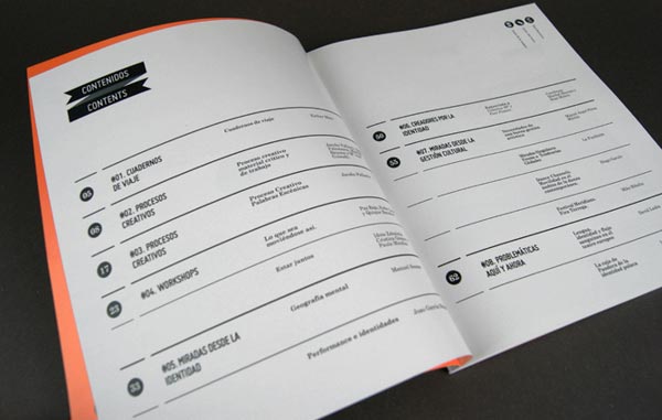
No.Zine

- Simple cover design uses two colour print.
- The design on the front of the magazine is aesthetically engaging and provokes the audience to interact with the magazine.

- A simple two column layout has been used on these pages.

- Here the designer has experimented with overprinting the article onto the title, I have not seen this technique before but it is something that could be experimented with.


- The above image shows an example of type that has been purposely placed to it bleeds over the edge of the page. I want to explore similar techniques when designing my outcome.


- I really like how the elements of this page are symmetrical and guide the audiences eye across the article.
- When designing the spreads of my article I will put a lot of thought into how the contents of the page interacts with the viewer.
PUBLICATION RESEARCH
Next, I collected a body of research into publications that really push the boundaries of magazine design. Focusing on layout, typography and illustration I want to form a strong body of visual research into contemporary magazine design. I want to look at how layout is used to guide the viewers focus around the page, and how this technique can be used to help the functionality of the page.
'THE OUTPOST'
Designed by Gema Navarro and Sant Serif


- A clear type hierarchy has been used on the pages.
- The spread has been printed in one colour, if I was to screen-print my outcome I could achieve similar results.
- One page has been printed so it is completely covered by colour whereas the other is white, this achieves a really nice balance of colour.
RED ESCENICA MAGAZINE
Designed by Casmic Lab
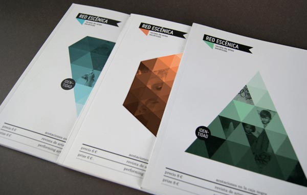
- This magazine is aesthetically engaging as it has a strong theme running throughout its pages. This is achieved by having the same visual elements on each page, such as the banners for titles, and circles with type and numbers inside them.
TAPESTRY MAGAZINE
Designed by Matt Edwards
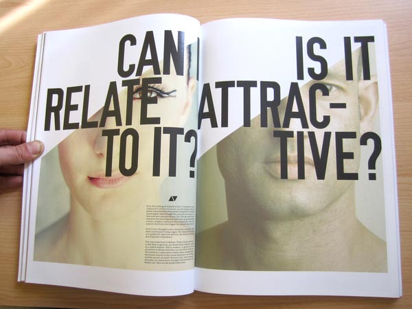
- The over sized titles on this spread grabs the viewers attention and provoke them to read the article.
- I want to experiment with using over sized type when designing my outcome as I think it is a good way of varying the style of a page. I find that when publications used the same font at the same size throughout a magazine they can become boring and become easy to overlook .

- The above image shows multiple images have been cleverly arranged on an engaging double page spread.

- The above double page spread works really well, it balances type and image by leaving negative space.
- Moreover, elements of the illustration have been cleverly adapted so that they bleed onto the opposing page. This makes the page of type less formal and more visually engaging.

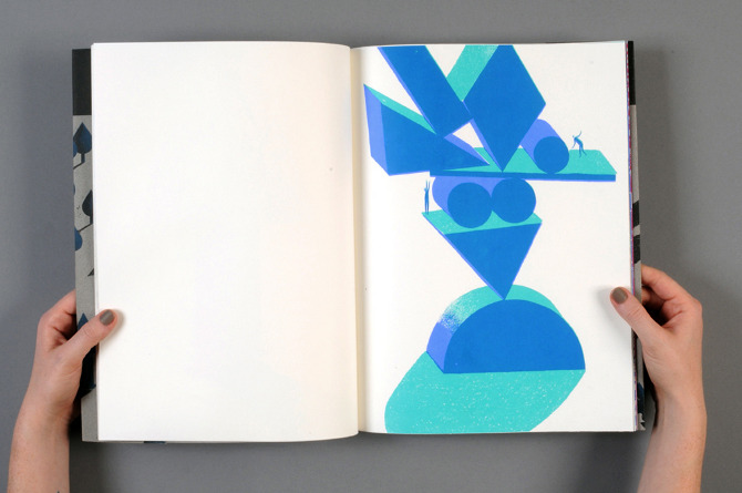
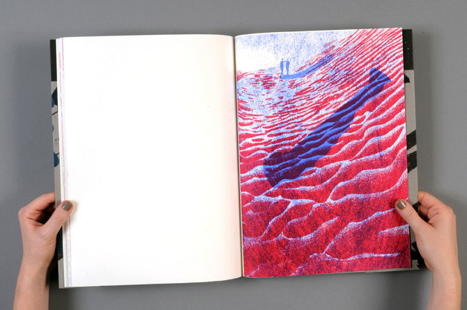
Moreover, I also looked at books that had been screen printed. This book was created by Eve Lloyd Knight. it shows a good use of screen printed illustrations, but lacks much typography.
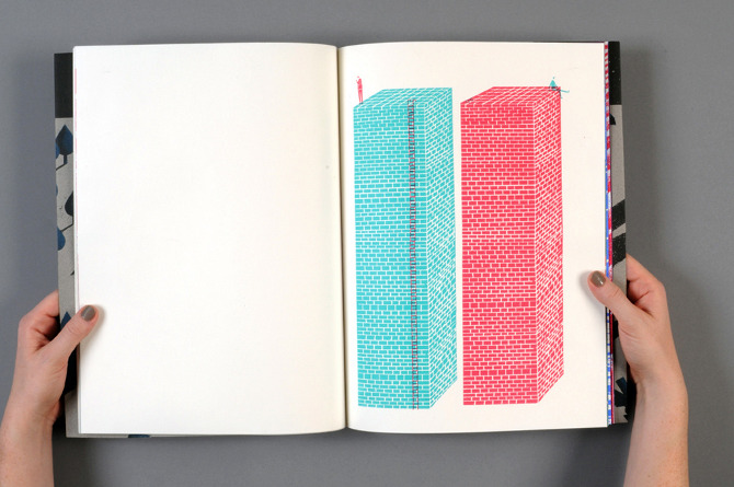
Baseline - A typographic survival kit for design students, created by Peter Dyre. This outcome is not screen printed but is a good example of the graphic quality I want my outcome to achieve.

- The outcome has been printed on news print, so some elements of the reverse page shows through.
- I will print my outcome on thicker paper at around 170 gsm.

- Rendering type in a different colour can highlight important information.

- The designer has used a grid layout to help arrange the elements of this spread.
- There is a clear use of typeface hierarchy.
- Good use of negative space balances that page.


Finally, I looked at this interactive typography book created by Kevin Steele.

http://escapekit.ca/post/44737986142/the-movable-book-of-letterforms
- The interesting pages of the book make the audience directly interact with its contents.
- I believe this is a good way of communicating information and making sure that it is remembered. People read books and magazine on a daily basis, so presenting information in a different way should help the viewer remember more of the information.
- When designing the pages of my book I will consider using similar methods of getting the audience to interact with its contents.
No comments:
Post a Comment