

BRANDING AND IDENTITY
FIRM Barbershop - Branding - Secondary web source
By Andrey Zhulidin and Boris Zelenkevich.
The first featured project was created for a barbers shop named 'Firm', to establish this identity the designers have decided to utilise a mix of illustrations and typography to communicate the company ethos.
Visual elements such as the illustrations are featured on aspects of the branding that the viewer would interact with first, such as the buisness card and informative booklet. Therefore, the audience are immediately introduced to the companys focus and the services they have to offer.
Additionally, visual elements have been applied consistently across all outcomes to create a strong and consistent visual identity.


Hilary's - Branding - Secondary web source.
By Ghost.
The branding shown below was created for 'Hilary's', a small boutique antiques store. The aesthetic theme chosen to represent the store of the graphics has a very organic feel, which is reflected through the hand-applied stamp tags to the off white colour of the stock.


filthymedia - Corporate Branding - Secondary web source.
By Filthy Media.
The success of this branding can be associated with a consistently applied black stock, with contrasting white and teal green elements. The stock choice forms a visual aspect that is applied across all aspects of the outcome to form a strong identity. Additionally, another dynamic aspect of the project that sets it apart form other formal branding projects are the parallel lines that run from one element of the outcome to another.


Fast Eddie's Barber Shop - Identity - Secondary web source.
By Richie Stewart.
The integrated identity created for 'Fast Eddie's barber shop' utilises an aesthetically appropriate logo that has been applied across the majority of the branding elements. The logo, supported with a relevant choice of typefaces, helps to form a consistent visual identity that accurately creates a vintage aesthetic theme.


Jeremy Maxwell Wintrebert - Identity - Secondary web source.
By Hey.
The concept driven branding displayed below was created by a design studio called 'Hey' for craft driven glass-blower 'Jeremy Maxwell Wintrebert'. The created identity is simple, focusing on the application of burnt white paper to reflect the subjects career. Moreover, a dynamic feel is injected into the project through the application of contrasting coloured ribbon, used to close the booklets.


Dylan Culhane - Personal Identity - Secondary web source.
By Ben Johnson.
The Identity created for photographer Dylan Culhane aims to communicate an aspect of the photographers identity through the visual elements of the outcome. A large amount of individual elements have been created for the project, such as poster tubes for disseminating photographs and letter heads for interacting with clients. The branding is successful as a consistent visual identity has been applied to all elements of the project, elements which are relevant to the subjects profession and will be applied when interacting with the outlined industry.


Hungary - Identity - Secondary web source.
By Kiss Miklos


PACKAGING AND PROMOTION
Brewdog - Promotion - Primary source.
By Hampton Associates
While walking back from university I was handed a promotional booklet and beer mat for a small independent brewing company called 'Brewdog'. The booklet acts as an introduction to the company offering the audience information on how the company was started, its manifesto and current products.
The booklet clearly focuses on communicating aspects of the company that outline it as 'different', 'independent' and even 'revolutionary'. Communicating this 'original' image makes the company appealing to a younger target audience, looking to find something different from their choice of beverage. Additionally, this ethos is supported through the aesthetic image applied to the company. The booklet displays a mix of grungy, distressed graphics with type-writer style typography to create an aesthetic image similar to that of an early punk zine or David Carson magazine composition.


Nordic Bravery - Bottle Packaging - Secondary web source
The packaging created for ale company 'Nordic Bravery' grabs the audiences attention through the engaging and relevant illustration. The image, portraying a viking style character, holds relevance to the company name and has been applied as the consistent visual element across all aspects of the packaging, and other associated outcomes.


McCoy's Crisps - Packaging - Secondary web source.
The packaging re-brand for McCoys crisps focuses on the functionality of the packaging in relation to the companies target audience. With a target audience consisting of manly 'men' McCoys crisps are specifically marketed as a gender associated food. To reflect this ethos the packaging re-brand has cleverly adapted the shape of the crisp packet, increasing its width and decreasing its height to make it more accessible for men with large hands.


First Aid Kit - Packaging - Secondary web source.
By Gabriele Meldaikyte
The project featured below showcases a revolutionary 'First Aid Kit' that has been designed with a focus on accessibility and simplified information. Firstly, the packaging has been designed with functionality as its focus, its contents are easily accessible and the pack opens to reveal all of the contents in an ordered, easy to digest fashion.
The concept behind the kit is to create a first aid box that quickly directs the audience to the treatment needed for the specified injury. The outcome achieves this through its quick to navigate content, that allows users to access the needed content with ease. Moreover, users are directed to the correct treatment through through simple semiotics that communicate information regarding a range of different injuries.
Finally, the simple graphics and outlines colour scheme portray a refined, medical feel that accurately represents the nature of the product.


Rise Coffee - Packaging - Secondary web source.
By Hillary Fisher
Below is a range of packaging created for coffee company 'Rise Coffee'. The concept supporting aesthetic theme and illustrations featured on the packaging focus on likening coffee-deprived members of the audience to zombies. The concept also simultaneously represents the name of the company 'rise', terminology that when used in context relates to a method of grave exit utilized by zombies.
The playful illustrations and attention grabbing colour scheme act as indications that the company take a light heated approach to marketing their product, making it appealing to a younger audience of coffee drinkers.


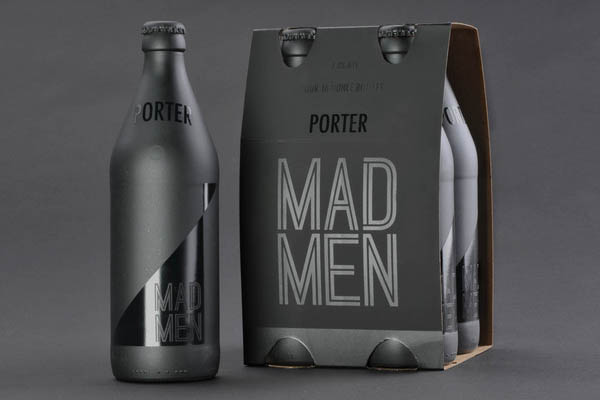
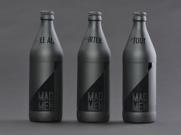
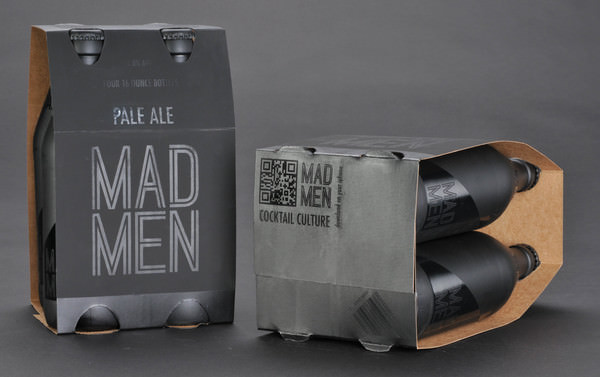
Mad Men - Packaging - Secondary web source.
By Samantha Mancl
The packaging and bottle designs showcased below were created for a beer company named 'Mad Men'. Aimed at the upper class working male the aesthetic was created to form a classy, dynamic appearance that makes the consumer feel comfortable relaxing with the beverage in a business type atmosphere. The choice of the black on black colour scheme helps to achieve this, creating a dark and enticing product that stands out from its competitors.

PUBLISHING & EDITORIAL
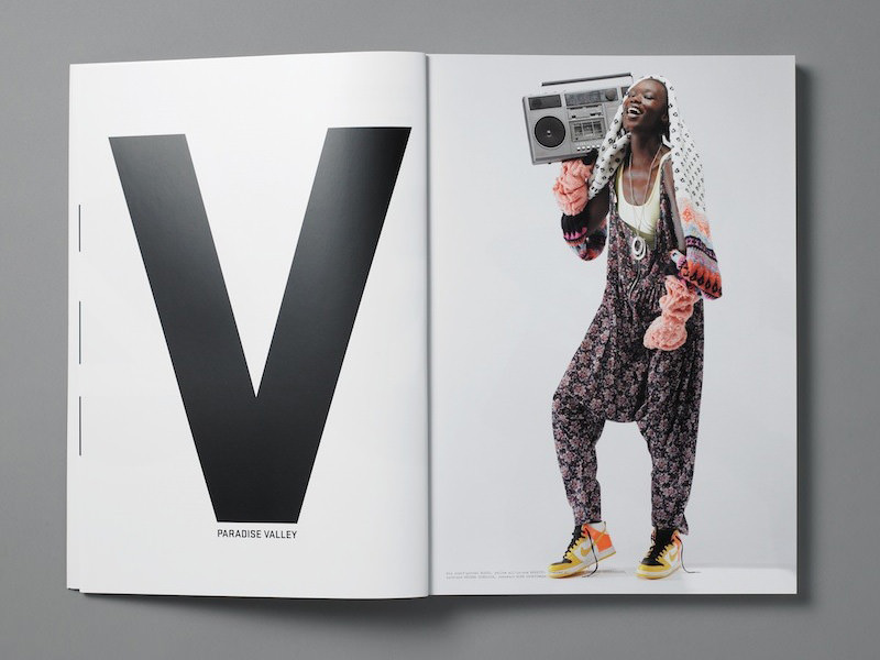
Huck Magazine - Publication - Primary source.
Published by The Church of London.


Land and Rain - Editorial - Secondary web source
By Atipus


Sandwich Book - Publication - Secondary web source.
By Pawel Piotrowski.


Publication - Secondary web source.
By Xavier Encinas
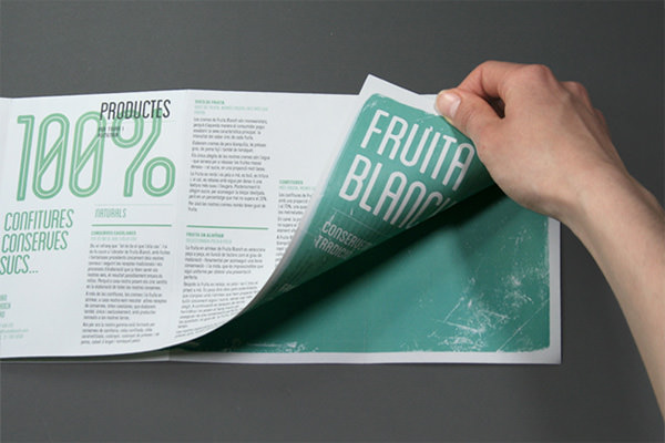
FRUITA BLANCH - Editorial - Secondary web sourcE
By Atipus


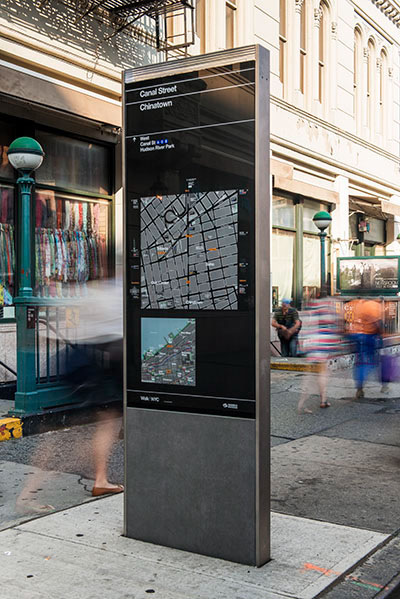
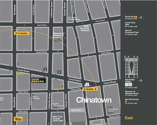
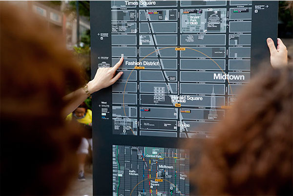
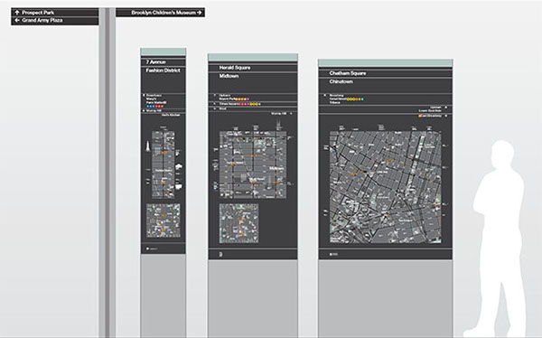
INFORMATION & WAYFINDING
By Tom Muller
Inforgraphic - Data Visualization - Secondary web source.
By Xavier Encinas
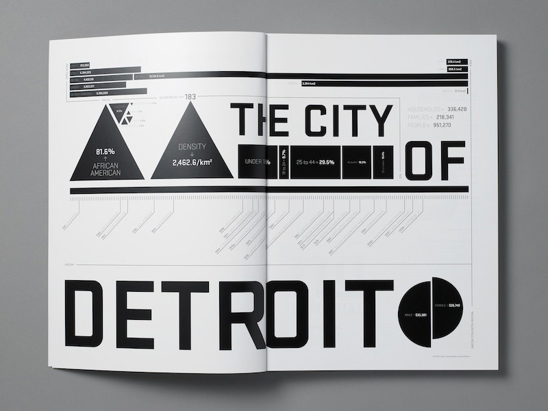
Link

Milk Chocolate Inforgraphic - Data Visualization - Secondary web source.
By Audree Lapierre


Wayfinding for Voskresenskoe entertainment centre - Data Visualization - Secondary web source. By Tomat Design and Maks Arbuzov


Link
Seven Summits Inforgraphic - Information - Secondary web source.
By Audree Lapierre

Link
No comments:
Post a Comment