
I started my research into colour by quickly reviewing my blog posts from last year.
IMPORTANT INFORMATION
- Yellow, Red and Blue are the primary colours, and the secondaries are orange, violet and green.
- The colours in between the secondaries and primaries are called tertiary colours.
- A well balanced colour composition requires all three primary colours to be balanced in equal quantities.
- Hue - The terms referrers to the unique characteristic of a colour that helps us visually distinguish them from one another. Hues are formed by different wavelengths of light.
- Saturation - This terms referrers to the purity of a colour. A highly saturated colour will have a strong hue, whereas a colour with a low saturation will have a pale, weak hue.
- Brightness - This term referrers to how light or dark a colour is. Changes in brightness can be achieved by mixing the colour with black or white.

This diagram referrers to how the eyes perceive colour, and the different wave lengths of light. I could also include information on how the eyes percieve light to help the audience get a greater understanding of colour theory.
Next, I made a list of important colour related topics that I want my print guide to include;
- CYMK & RGB.
- Colour combinations.
- Tints & Shades.
- Blacks.
- Colour Management.
- Spot & Process colours.
- Duo-tone images.
- Colour Half-tones.
- Half-tones.
CMYK & RGB
After recapping some basic colour theory information I used the book; 'The Print Production Manual' By Gavin Ambrose and Paul Harris, to collect further, in-depth secondary research.

- A colour is made up from different wavelengths of light.
- There are two main colour models that relate to design work, for screen based media the RGB colour mode should be used, for printed work the CMYK colour mode should always be used. Selecting the wrong colour mode will result in a colour misrepresentation on your final printed outcome.
- CYMK is a subtractive colour mode, meaning that when colours overlap they form a darker secondary colour such as Blue, Red or Green. Where all three primary colours overlap black is formed as no light can escape.
- RGB is an additive colour mode, meaning that when colours overlap they form a lighter colour, such as Cyan, Yellow or Magenta. Each additive primary colour represents a component of white light, therefore when all three colours overlap white is produced.

An Additive RGB colour diagram - Link

A subtractive CYMK colour diagram - Link
A good understanding of colour management will help my audience to produce functional, informed design work. Therefore, I next reviewed information regarding the colour management process.
COLOUR COMBINATIONS
 Monochromatic Relationship Colors that are shade or tint variations of the same hue.
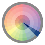
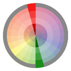 Complementary Relationship Those colors across from each other on a color wheel.
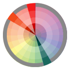 Split-Complementary Relationship One hue plus two others equally spaced from its complement.
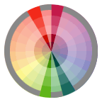 Double-Complementary Relationship Two complementary color sets; the distance between selected complementary pairs will effect the overall contrast of the final composition.
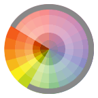 Analogous Relationship Those colors located adjacent to each other on a color wheel.
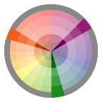 Triad Relationship Three hues equally positioned on a color wheel.
- The above colour wheels come in useful when it comes to choosing a functional colour scheme so I have decided to feature them in my outcome.
- I was also thinking of including Itten's seven contrasts that we covered in last years design principles sessions.
COLOUR MANAGEMENT

- Colour management is a term which refers to how colour is translated from one piece of equipment in the print process to another, it is essential in ensuring that colour reproduction is accurate as different softwares produce colour differently.
- Gamuts and colour spaces are used by designers to calculate the range of colours that can be produced with a given set of colourants on a particular piece of software.
- Gamut - In the printing industry the common gamuts consist of RGB, CMYK and more recently Hexachrome, which is a six colour gamut consisting of CMYKOG (O - Orange, G - Green).
- The range of colours perceived by a human can also be described as a gamut.
- Colour printing systems cant reproduce the full gamut spectrum that humans can perceive. However, RGB gamuts can reproduce about 70% of these colours and the CMYK gamut produces even less than RGB.
- Designers need to be aware of the colour limitations when printing in CYMK so they dont choose a colour that cant be printed.


- In order to have accurate and reliable colour reproduction it is necessary for designers to know how different devices in the design and production system use colour.
- The International Colour Consortium has produced a set of standardized colour profiles to ensure colours are used consistently across a range of devices.
- 'Euroscale Coated' is a colour profile that has been designed to produce quality colour separations for CMYK prints.
- SWOP (specifications for web offset publications) is a colour profile used to ensure consistent quality of advertising in America. Adobe Photoshop uses the SWOP colour profile as a default for making CYMK colour seperations.
SPOT & PROCESS COLOURS
Anyone preparing work that will be commercially printed needs to understand the difference between spot and process colours, mixing up these terms up could seriously affect the cost of a print job.

- Graphic designers use spot colours to ensure that a particular colour in a design will print how it is shown in the Pantone colour guide. It is a useful technique to apply to work if the colour you are trying to achieve is outside of the CYMK gamut or if there is a specific need for a certain colour.
- A process colour is made up of dotted laters of CYMK inks whereas a spot colour is a specifically mixed colour that is applied in one solid layer.
- Special colours have greater intensity and vibrancy. Moreover, spot colours are printed as a solid colour, rather than being built up of the four CYMK colours.
- Spot colours will often print with much more vibrancy than a process colour (CYMK) as process colours are made up from half tone dots. A spot colour is applied as a flat colour and so loses no colour value. The CYMK colour is essentially just a tint which is why it lacks intensity.

PANTONE MATCHING SYSTEM

- Spot colours are made from various elements and are mixed to a specific recipe, the colours can be bought pre-mixed or can be created by following one of the recipes.
- The Pantone Matching System has been developed to include a wide range of different colours. Each guide offers designers a chance to view a different colour ranges which can include special solid, hexachrome, metallic and pastel hues.
- The system allocates a unique referencing number to each hue and shade to ensure that it is easy for designers and printers to communicate about colour.
- U = Uncoated.
- C = Coated.
- EC = Euro coated.
- M = Matte.
- Pantone Solid - A range of solid metallic, pastel and process colours that can be used on different paper stocks and substrates.
- Pantone Pastels - A range of flat, solid and very pale colours. They differ to tints as they are printed as a solid colour without dots.
- Pantone Hexachrome - A range of six process colours used for hexachrome printing. In addition to the CMYK process colours the system adds greem and orange allowing it to produce 90% of the Pantone PMS colours.
- Pantone Metallics - A range of over 300 special colours that give a metallic effect.
- As the Pantone colour matching system is used across the graphic design industry I think that it is important for my guide to include a detailed introduction to the Pantone system, colour guides, colours and how they should be used.
MULTI-TONES

- Duotones, tritones and quadtones are tonal images produced from a monotone original with the use of two, three or four colour tones that are normally offset against a black base tone.
- Any multitone image begins as a monotone image, if an image is not already monotone it can be easily changed in Photoshop.
- A duotone image is made of two colours such as black and yellow. For an effective looking image the two colours need to be balanced, otherwise it will produce an image flooded with colour.

- Tritone images are created when another third colour is added. Specific preset values can be added to the options panel to create different effects.
- If an image is created using Pantone special colours but is to be printed using a CMYK print method then the colours must be converted to the CMYK colour space.
- Quadtone images are created when a fourth colour is added. As with tritones preset values can be added to the options panel to create a range of different effects.

A quadtone image created using Photoshop - Link
COLOUR HALF-TONES

- The CYMK printing process creates images from different sized half-tone dots of cyan, magenta, yellow and black. These coloured dots combine to form a continuous tone image, that tricks the eye into seeing a full colour print.

This image shows an example of the CMYK dots close up, using the naked eye these would usually be very hard to see. However, there is a tool available called a 'linen tester' which is used to magnified printed material so that the designer can check the quality of the print.

Linen Tester - link

- The half-tone dots of each coloured plate interact with one and other to form the full colour image that our eyes perceive.
- They create this effect because the dots are aligned at different angles.
- Any changes to the half-tone dots or their angles must be made on the individual colours layer.
- The size of the dots and their angles can be changed using the dialogue box found on software programs such as Adobe Photoshop and Illustrator.
- CMYK prints will utilize four colored screens, each representing an individual CYMK colour.
- When the angles of a screen are not set up correctly the layers interfere with each other and create moire patterns that disrupt the clarity of the image.
COLOUR IN PRINT

- There are various methods that a designer can utilize to ensure that any colour used will appear as intended. After a piece of work has been sent to print there are rarely any further opportunities to amend mistakes.
- PP or printed pages is a term that refers to the actual number of pages printed on not the number of sheets, for examples one sheet requiring double sided printing need two pages to be printed.
Before sending a file to print;
- Delete all unused colour.
- Ensure that the black you want to print is the correct black, not registration black, as this will print in all plates.
- Ensure that the registration you want to print is in registration and not another black as black will only print on the black plate.
- Ensure all spot or special colours are accounted for, if printing in CYMK turn all the spot or special colours to CYMK.
- Ensure all images are converted to CYMK and not RGB. This includes all printed digital elements.
- Ensure that your colour fall matches the printers expectations. If a printer is expecting a simple four colour print then you supply a file with a spot colour it will cause confusion.
- Ensure that your swatchs are of the right value, if the job is being printed on uncoated ensure all colours as uncoated.

- Process and special colours can be combined using tints and over printing to produce different colour effects.
- Three trichromatic process colours (cyan, magenta yellow) can be printed in increments of 10% to produce over 1330 tints, the number is over 15000 if black is included as well.
- Tints below 10% and above 90% may not print effectively due to dot gain.
- Overprinting - where an ink overprints another to create a new colour.
- As colour theory teaches, the three primary subtractive process colours create the additive primary colours when mixed with one and other.
- Different blacks can also be achieved using overprinting.
- To overprint effectively designers must take into consideration the order in which the inks are printed.
- If the printer prints in the order CMYK then the yellow can obviously not overprint the cyan.

Overprints at various percentages - Link
- My print guide could contain a similar print diagram showing overprinted colours, this would help the audience when working with overprints as they can get confusing.

- Tints of two or more colours can be combined to create new colours using the multi-ink function.
- The combined colours are duller in appearance and become more duller as more colours are selected.
- The percentages of different colours can be combined to create a range of new colours.
- Working with two colours can be restrictive, but colour mixing presents designers with the opportunity to increase the colour pallet.
- Each CMYK ink can be applied with a value ranging from 0 to 100, colours are usually therefore presented in percentages.
- Colour values exceeding 240 can result in a muddy colour.
- It is difficult to achieve a very light tint as colours drop off or fail to register.

- The tint chart shown above shows the 121 tint variations that can be achieved when cyan and black are combined in 10% increments.
- Over 1000 different tints can be created by mixing cyan, magenta and yellow process colours, even more colours can be achieved if black is added too.
- Using tints allows the designer to increase the colour ranges when a print job has a limited budget.
- As tints are produced using half-tone dots very light tints such as the ones below 10% do not print well.

- These charts show the colour variations that can be achieved when mixing various process colours. My outcome could include some similar diagrams to visually support information communicated in the guide.
No comments:
Post a Comment