
BRANDING - PHILIP SANTA - Iaz studîersch zeîn jour und nor wearsch korbflickr?
The project displayed below was created to inform and educate the audience about the lost art of basket weaving while simultaneously making it accessible to a new audience. To communicate the concept the designer has created a range of simple, well composed booklets and posters to display information supported with beautifully rendered illustrations.
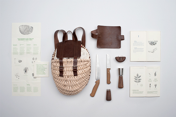
- The project is successful as it effectively applies a consistent layout and well represented aesthetic theme across all outcomes.
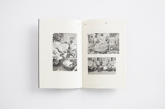
- Images help to capture and communicate the heritage behind the craft.
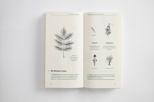
- The simple, one colour plant drawings are effective as their detail is attention grabbing and entices the audience to further interact with the projects content.
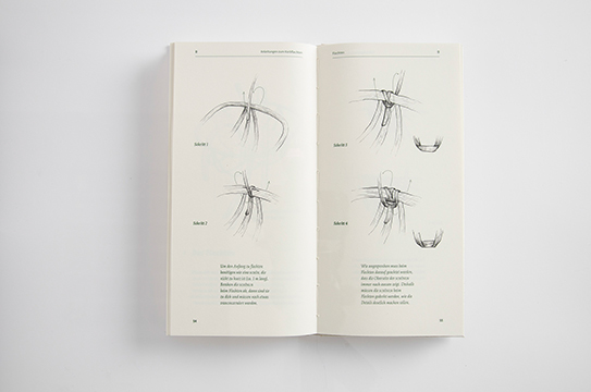
- Finally, the booklet instructs users as to how to weave their own basket. The complex technique uses step by step illustrations supported with focused information to help guide the viewer through the construction process. When formulating my response I want the 'Build-guide' to communicate the Windowfarms construction process in a similar manner.
IDENTITY - LISA NEMETZ - VQV
Next, I reviewed a branding project created for 'VQV' an organic food restaurant. The project has relevance as it communicates similar aesthetic themes relating to sustainability and organic produce.

- The logo effectively communicates the companies organic ethos through the application of plant/leaf symbolism.

- The natural green colour scheme has been carefully selected to reflect the nature of the products sold in the restaurant. Additionally, it also simultaneously represents organics, nature and sustainability.
- Moreover, the detailed plant illustrations applied across the project are also relevant to the concept of the branding and act as a visual prop to engage the audience.

- The project has a strong concept and is appropriate represented through the use of an appropriate logo and colour scheme. Despite this, I believe that the project could have benefited from a more relevant stock choice, such as an off white/brown recycled paper.
- When creating my outcome I will carefully consider stock colour and how it could also be used to further support the sustainable/natural aesthetic image outlines.
INFOGRAPHIC - MANUEL BORTOLETTI - Infodesign for local agriculture
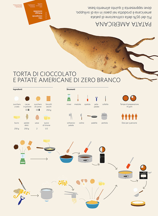
Below is an inforgrqaphic design project that communicates information regarding a selection of crops that grow in Italy. Moreover, The project utilises plant illustrations, data visualizations and informative content to make the information interesting and easy to digest.
The project holds relevance to my outcome as data regarding the growing conditions of crops is communicated in a way that would also benefit my audience. In my grow guide I want to display data relating to the crop cycles and optimum harvest time, infographics similar to these could be used to successfully deliver this information.
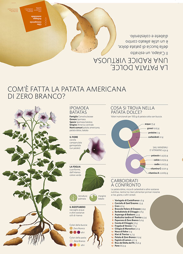
- Pie chart variations have been applied to communicate data regarding mineral and nutritional information.
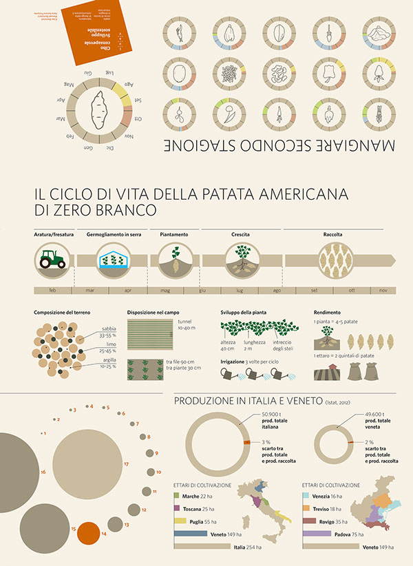
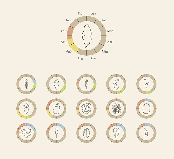
- The diagrams above visualize information regarding the planting and harvest times for specific crops. Similar diagrams could be used to successfully deliver information regarding plants for my outcome.
BRANDING - ALEXANDROS MAVROGIANNIS - The Living Co.
The Branding showcased below was created for an organic trade store called 'The Living Co.' The aim of the re-brand was to give the company a rejuvenated identity to help them become popular again.
The branding contrasts vintage, etching style illustrations with a bold modern typeface to create an engaging aesthetic that captures the audiences attention. One thing that really stood out to me was the application of etching style vegetable illustrations. As a creative their detailed aesthetic captured my attention immediately while simultaneously supporting the organic ethos of the company. The application of the illustration was so effective I was inspired to experiment with creating a similar aesthetic image for my outcome.

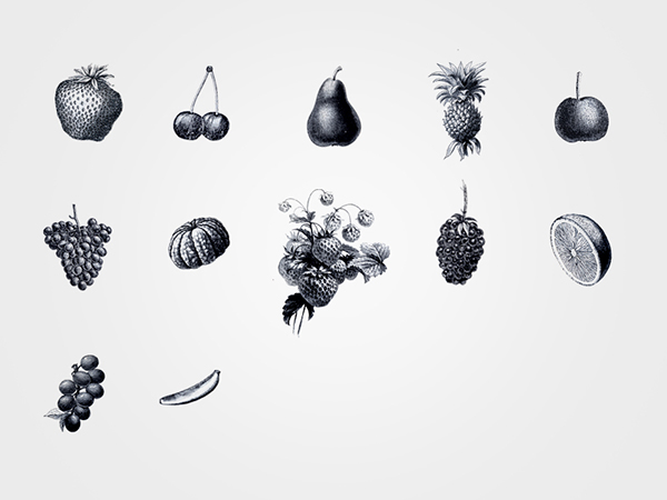
- Etching style illustrations.

- A strong contrast is created between the detailed, mono-tone fruit illustration and the simple, bright logo.

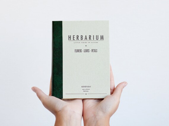
BOOK - Herbarium.
Finally, the book 'Herbarium' was created as a publication in which flowers, leaves and petals can be pressed and stored, eventually creating a physical dictionary of your collections. The concept behind the book holds no relevance to my outcome as I do not want to press flowers into it. However, the simple typographic aesthetic, choice of natural looking stock and application of packaging are all inspiration for my project.
Firstly, the typographic book cover, although simple, has a certain inviting elegance about it, that entices the audience to further engage with its contents. My outcome could feature a similar, simple aesthetic to contrast the image heavy content within the booklets pages.
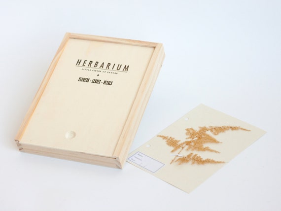
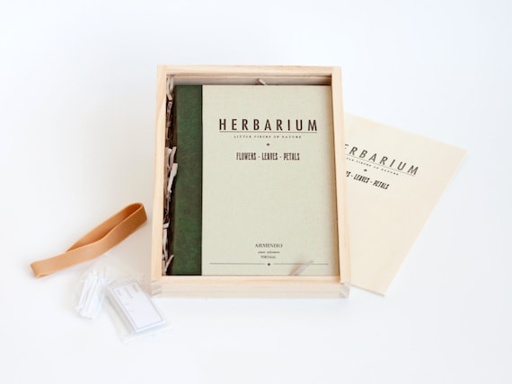
- Finally, the choice of packaging also effectively rounds the project off, acting as a way to protect the booklet and make it more presentable. I believe that my printed outcomes could really benefit from similar packaging. However, I will need to consider how it could be completely sustainable like other aspects of my project.
No comments:
Post a Comment