
As for part of my outcome I will be proposing a redesign of the current Windowfarms website I decided to analyse the site, reviewing its functionality, navigation and aesthetics. Reviewing aspects of the site will allow me to highlight problems that my outcome can resolve, improving the online aspect of the company and integrating it with the rest of my project branding.
HOMEPAGE
Upon opening the site users are greeted with the homepage, it acts as an introduction to the company, giving users a view of the product in action while providing some brief information on the project and general movement.
Although the site offers users a quick introduction to the product and company the focus is on the image and the sponsors located at the bottom of the page. I believe that the site would function more effectively if more focus was directed at the content introducing the audience to the company product.
Additionally, I think that including photographic aspects is important as it gives the audience a chance to see the product in use, this simply cannot be achieved through the application of illustrations as they do not achieve the realistic situation viewers can associate with.

WHAT IS A WINDOWFARM?
The navigation bar for the site is located at the top of the page, when a users clicks on the title a drop down menu of additional links is revealed. The drop-down works effectively at allowing users to access a range of different pages and reduces the amount of page links on the navigation bar.
The 'What Is A Windowfarm?' page offers users an in-depth introduction to the product, how it works, sustainable factors and possible produce. The page is important to the sites success as it offers users important information about the product and how it works. Often, before people engage with the outcome or company they will want to overlook an in-depth review of the product and why it is beneficial. Therefore, a page introducing people to the technology and how it is relevant to them is essential to the success of the company.
Additionally, to help communicate information about the workings of a Windowfarm, moving gif. images have been applied that showcase the function of the product. The illustrations have been applied really effectively and offer users a more interactive view of how the product works. Furthermore, this helps to communicate aspects of the function and therefore results in the requirement of less explanatory content.

WHAT GROWS WELL?
Another important aspect of the site is the 'What Grows Well?' page. In this section of the website users are shown a list of vegetables, herbs and flowers that can be grow in a Windowfarm.
The page enables both new and old users to refer to a list of established plants that will grow if planted in a Windowfarm. Not only can users refer to this list when purchasing seeds, but it also displays to new users what can be grown in a Windowfarm should they choose to engage with the project.
With regards to aesthetics, the website features photographic imagery of each plant that can be grow. I believe visually supporting information is a very important aspect of the 'What Can Be Grown' page as it allows people with little or no growing experience to see what the individual plant looks like. When re-designing the page I will ensure that imagery or illustrations of each individual plant is included.
Although this page is successful, I believe that it would be more effective if users could click on the plant displayed and review its individual growing conditions. This way, users could then not only see what could be grown, but the conditions in which the plant thrives in. The provided information could then be applied by users to adjust the microclimate of their windowfarm accordingly.

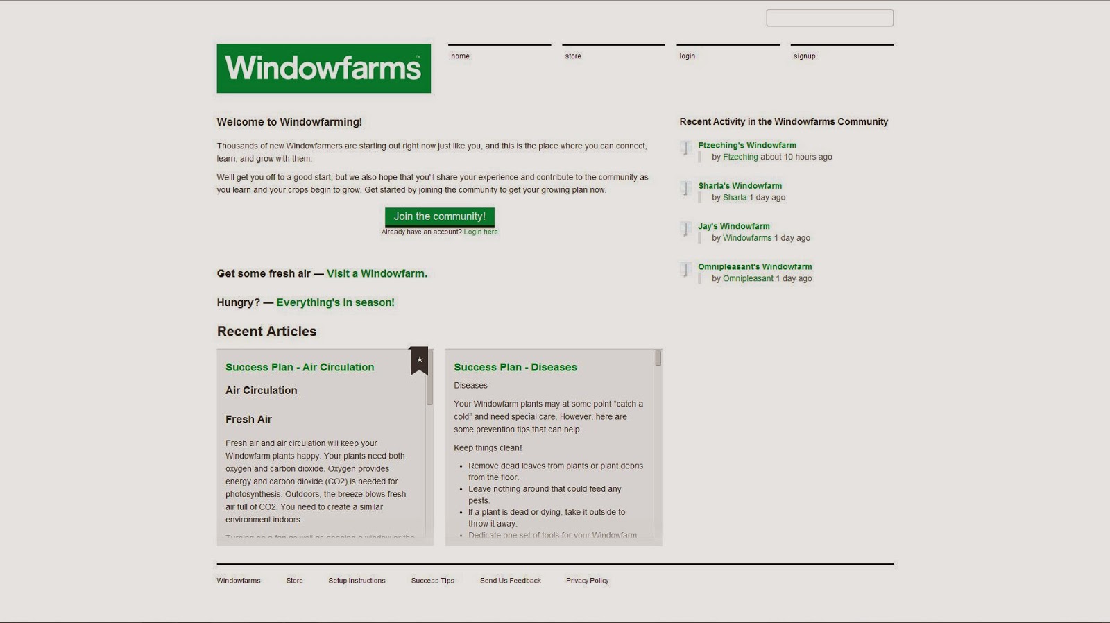
COMMUNITY WELCOME PAGE
The next section of the site I chose to review is the page that users are greeted by once they click on the 'community' section of the navigation bar. Upon first opening the page the audience are greeted by a brief introduction to the community, some recent articles, a link for joining and some recent activity which has a live update feature applied.
The pages main function is to act as an introduction to the Windowfarms online community, and direct users to the log-in/sign up section of the site. Although this is successfully achieved, I believe that the pages function could be improved with the application of more attention grabbing features. At the moment, the page looks very bland and uninviting as the page consists prominently of small text with little variation.
COMMUNITY LOG IN
Once users click on the 'Join the community' button featured on the community homepage they are taken through to an additional page where details are entered.
With regards to aesthetics, the page is very plain and applies only the bare bones of the websites skeleton. I believe that the site could be improved if this log in window popped up on the community homepage, or if in fact it was included on the community homepage. Doing so would reduce the number of pages the user has to navigate through to land on certain pages of the site and hence improve navigation.

COMMUNITY HOMEPAGE
After logging in, users are forwarded to the 'our.Windowfarms' community homepage, which acts as a platform for all of the additional pages that span from the community. I believe that this is one of the most important aspects of the site, as the community provides users with the platform to exchange information regarding all aspects of the Windowfarm, from its complete construction to the different growing process applied to plants.
The Windowfarms community homepage is very busy, users are greeted with a mass of information and links relating to a range of different product related articles and threads. Although there is a lot of useful information available on the page, I believe that the way in which it is presented is a bit overwhelming. Users would benefit if the content was organised in a more refined, chronological fashion, allowing them to quickly navigate the available content to find the information needed.
With regards to the aesthetics, the community page seems to utilise a different logo, navigation bar and applies a banner image, making the specific page different from others previous to it. Personally, I believe that this affects the sites aesthetic quality as it makes the individual page indifferent to others, affecting consistency and making the website look disjointed. When re-designing the site I will ensure that I keep all pages in theme to keep the website consistent and in theme.


STORE
The final page that I reviewed was the online store, which is used as a platform for the sale and distribution of a range of products directly relating to the Windowfarms product and company.
Firstly, the navigation and functionality of this page is much more successful that others reviewed before it. The content has been organised into a structured, easy to follow composition that allows users to see information relating to their account and cart, but also the products available online. An additional aspect I thought was really effective was the division of the products. The site divides the products into specific sections such as 'Plants/Nutrients/Seeds' and 'Accessories', allowing users to select specific product ranges instead of having to scroll through a range of goods.
Additionally, an important aspect of the page relates to the aesthetics, specifically the application of product images. Each of the items available on the online store are visually supported with imagery allowing the user to review what they are buying. I think that this is an important aspect of the online store as the product images allow members of the audience to review what they are buying, giving them more confidence to make the purchase.

No comments:
Post a Comment