- Stock.
- Print method.
- Typefaces.
- Colour Scheme.
- Visual theme.
- Form.
While making decisions relating to each individual section, I considered the content that will be featured in the book, the concept of sustainability, the audience & how to engage them and the environment in which the outcome will be distributed.
Thinking about such considerations when defining the design decisions early on in the project is an important aspect of the design process, as it ensures that the outcome is informed and appeals to the outlined audience.
STOCK -
As outlined on the previous blog post that evidenced the process of stock selection, it was concluded that the most appropriate choice paper is the newsprint available form university.
After speaking to one of the people working at the library I ascertained that the paper is recycled and made from post consumer waste. Moreover, purchasing the stock from the library allows me to buy a specific number of sheets and reduce any waste from the production process, an option that is not available if purchasing paper form commercial suppliers.
The stock has a light gsm, which is a common feature among newspaper publications helping to establish the theme the outcome aims to achieve.
PRINT METHOD -
The print method selected to produce the newspaper is the process of screen printing; a low-impact printing technique that is predominantly human powered and has the ability to create large print runs.
The versatile method was selected due to its low cost, low environmental impact and ability to create layered, semi-opaque illustrations to visually engage the audience.
To further ensure that the selected method reaches the high level of sustainability required, a selection of vegetable based acrylic paints have been purchased that are free from the Volatile Organic Compounds (VOC's) that are commonplace in most acrylic paint.
TYPEFACES -
When selecting typefaces for the project I wanted to stray away from the hand rendered, tribal inspired fonts that are commonly used in the visual identities of most transformational events. Such fonts have a good display purpose, however, I find that the often the progressive letter forms inhibit legibility, something I want to avoid at all costs.
To ensure that the selected typefaces still appeal to the interests of the primary audience, I want to select a bold, attention grabbing sans-serif typeface, which will be used for headings and subheadings. The typeface will often be displayed along side illustration which will help to appeal to the visual preferences of the audience while not sacrificing any legibility.
The display typeface will be supported by an additional sans-serif typeface selected for its legibility at smaller sizes and visual cohesion with the primary font.
PRIMARY TYPEFACE -
The primary typeface chosen for the project is called Colaba, an all caps display font with rounded edges. The font was selected as it is attention grabbing, easily legible and meets the criteria defined above.
The primary typeface chosen for the project is called Colaba, an all caps display font with rounded edges. The font was selected as it is attention grabbing, easily legible and meets the criteria defined above.
SECONDARY TYPEFACE -
The secondary, supporting typeface is called Letter Gothic, and was selected as it mixes well with the primary font and is legible at a range of small sizes.
The secondary, supporting typeface is called Letter Gothic, and was selected as it mixes well with the primary font and is legible at a range of small sizes.
COLOUR SCHEME -
To appeal to the interests of the primary audience a colourful visual scheme is essential, as psychedelic inspired visual art is common place at most transformational events. When selecting a colour scheme it was this consideration which helped to define the final selection of colours used.
The chosen colours, which are displayed below, take inspiration from the standard CMYK colour pallet used in most commercial printing. However, unlike the bright tones of a standard CMKY pallet, the the vibrancy of the colours is muted slightly to give them a more natural, earthy feel, an aspect that which will appeal to the interests of the audience and help to engage them with the content of the outcome.
FORM/SIZE -
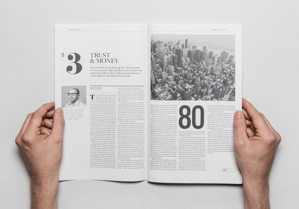
Taking inspiration from the newspapers reviewed as part of my visual research I decided the most appropriate form the newspaper will be a small, handheld outcome that the can be easily transported and carried by the reader. As the paper will be disseminated at transformational festivals, its small size is appropriate and will not inhibit readers who need to travel or read the publication as they move around the festival.

VISUAL THEME -
The visual theme, specifically referring to the illustrations that will be featured in the outcome, will be inspired by the psychedelic art and graphics inherent to the transformational festival movement. Such visuals engage the primary audience and will help to create a more informed, relevant outcome.
The image below displays the Boom Festival website, which is colourful and includes a range of intricate illustrations all of which have relevance to the themes and values encompassed at the event.
When creating visuals I will create a spider diagram and outline a selection of relevant themes the illustrations will be based upon.


No comments:
Post a Comment